
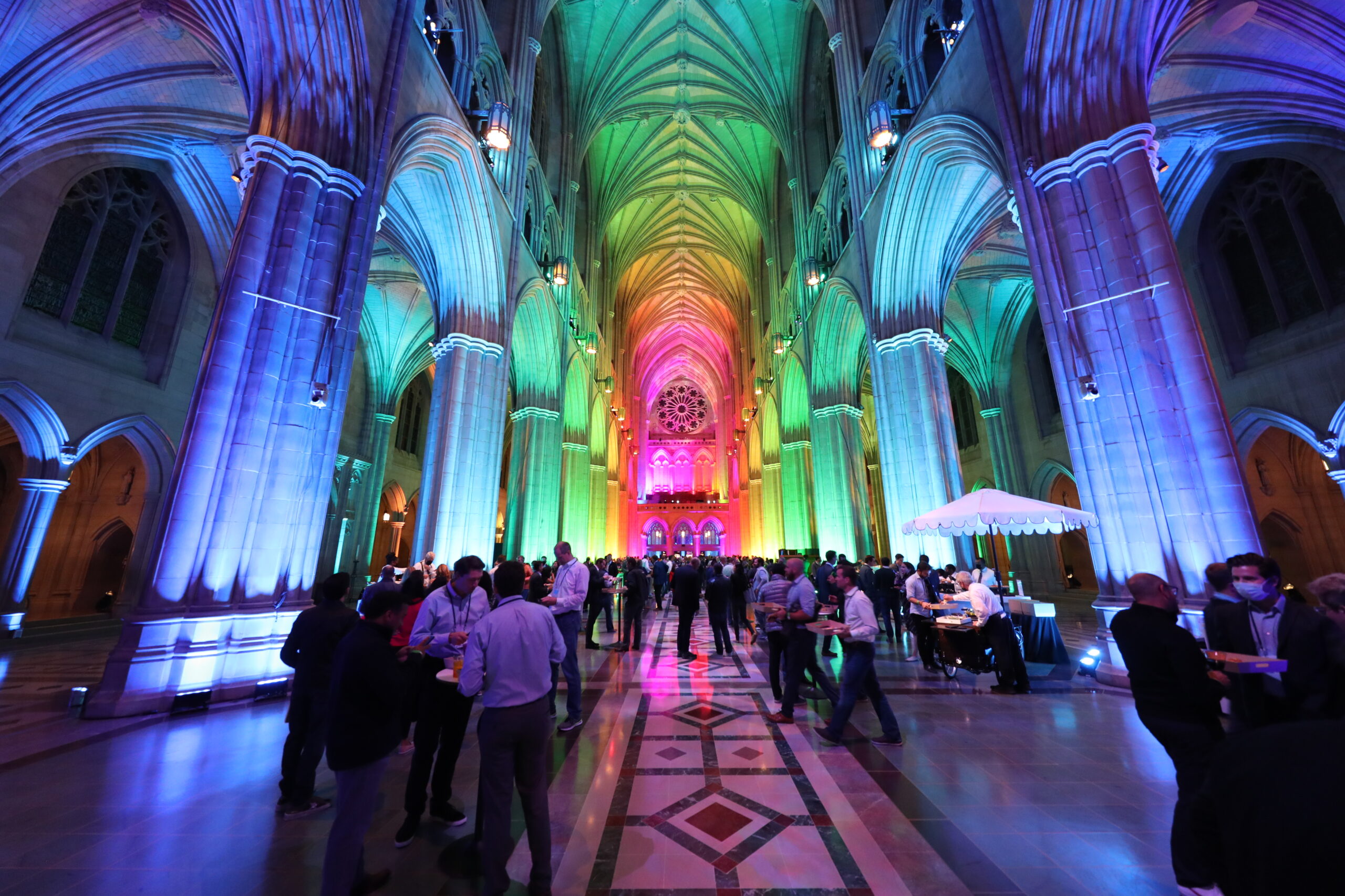
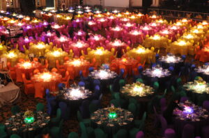
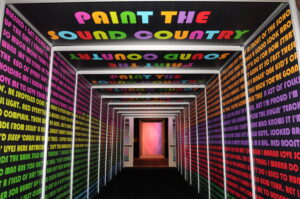
What a show stopper! This technique was designed to grab the attention of people due to the bold structuring of these shapes and colors surprisingly working well together.
Color blocking showcases colors on opposite ends of the color wheel to create something unique for guests to fascinate over.
How do you succsessfully pull off Color Blocking?
This type of design began in the world of fashion but has recently broken into the event design industry, getting creative with portraying this idea into objects and décor. It has its challenges when it comes to getting the colors right for your specific space. It is important to be aware of the power of this design technique and use it to its full potential; it’s easy for colors to clash when not thoroughly thought through. Make sure you know what color palette you are looking for so that it complements the space and message of the event perfectly. It’s easy to get carried away!
Be sure to follow the 3 rules of Color Blocking:
1.) Start with a neutral… neutrals are your friend.
Everyone needs a base to start with. Let this neutral be the subtle start to your colorful masterpiece!
2.) Stick to 3-5 bold colors and run with them!
You don’t want to overcrowd a space with too many colors. Pick your daring statement shades and use them to your advantage!
3.) Utilize every shape in your space.
Find the horizontal, vertical, rectangular and square dimensions at your events venue that most would glance over and give them a new life with color blocking!
The PRA Creative team is ready to put this in action. Let’s get started on your next colorful event design that will fully immerse your guests in living color! Click here to get started.
DestinationNewsletter
Waterfront Fine Dining on the san Diego Bay

Recent Blog Posts
July 19, 2023
Color Blocking in Event SpacesNovember 18, 2022
Experiential Activations – Nostalgia Marketing and EventsAugust 29, 2022
Citizen Watch America PartnershipJuly 29, 2022
Best Outdoor Venues in the NortheastJuly 13, 2021
Go Plastic Free in JulyApril 20, 2021
Celebrating World Creativity + Innovation DayMarch 15, 2021
The Flow of Water + EventsFebruary 22, 2021
Elevate Your Investor Day with PRA Digital ServicesFebruary 16, 2021
Plant a Tree with PRAFebruary 11, 2021
8 Tips + Tricks for Hybrid Planning
Leave A Comment